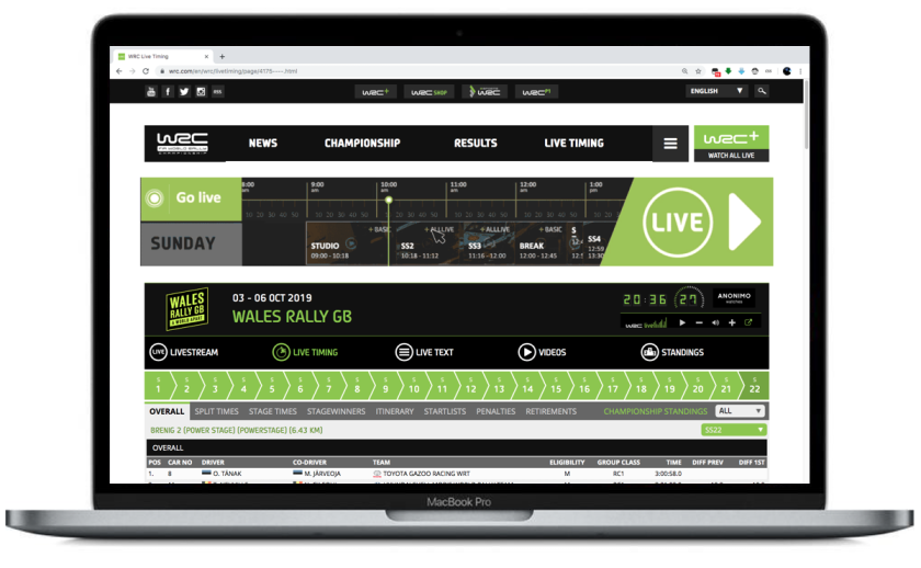
Since a couple of years, I'm closely following Thierry Neuville in the World Rally Championship. Live timings for every rally are available on the official wrc.com website. Unfortunately, this website is cluttered with ads and other irrelevant content (see screenshot below). This makes the experience of following a rally far from ideal.

The cool thing about the Web however, is that the user has the power to decide how a webpage is rendered in the browser. This is made possible by the fact that website front-end code is build according to open standards: the HTML, CSS and Javascript which make up every website can be changed before it is rendered in the browser window. In the context of our wrc.com case, CSS is the most interesting of the 3 technologies, since it can be used to change what is shown on the webpage, just what we need to get rid of those annoying ads.
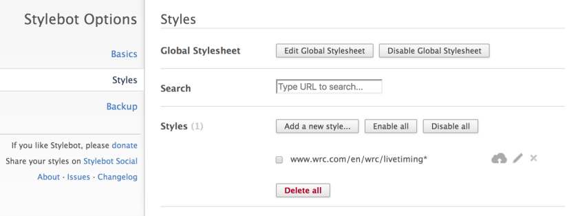
To change the CSS, we need a browser plugin called Stylebot. This tool allows us to add extra CSS code to any website and change its look 'n' feel (see screenshot below).
I created a simple set of CSS code which makes the available live timings much more digestible.
header, footer, div a img, p.ad, ul.livecenter-subnav, .logo_wrcplus, .box.cad, .box.w1.f, .driverbar, .epgBox.box.w1.f h3 span, .liveheader, .mCSB_scrollTools, .bigsize, .billboard, .footer-sponsors, .content > div:first-child {
    display: none;
}

.logo_wrc img {
    display: block;
}

nav {
    margin-top: 0;
}

nav .wrapper ul {
    width: 87%;
}

main {
    padding-top: 0;
}

#m_more_2 {
    right: auto;
}

#m_live-timing_2 {
    color: #8dc72d;
}
For the best result, these style rules should be applied to all live timing pages. This can be done by using the following URL pattern:
www.wrc.com/en/wrc/livetiming*

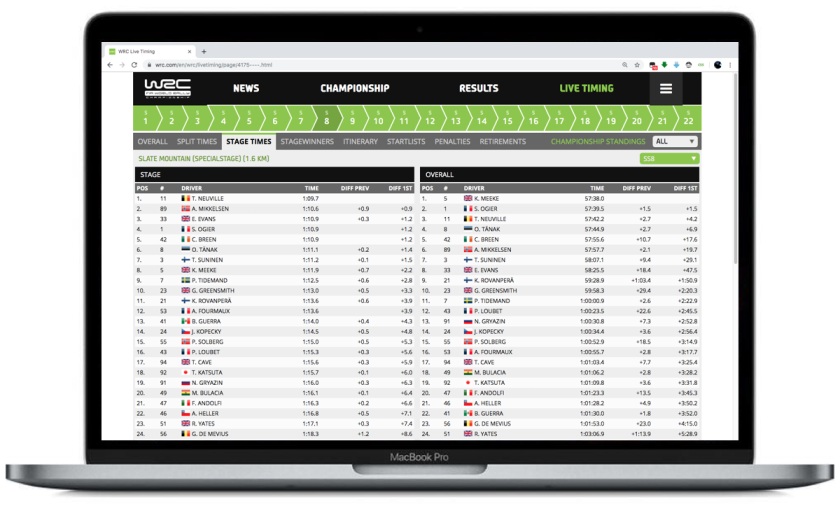
The screenshot below shows the result after applying the necessary CSS overrides: all unnecessary elements are hidden on the page. This includes sponsors, ads, promoted content, etc. All that is left is the actual live results.
A much better experience!

Update
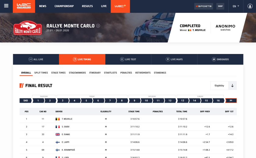
Off course, the WRC has updated its website so all of the above does not apply anymore ? Fortunately, the update is for the better: there is much less clutter now when consulting live results (see screenshot below)! The new design for the website in general is a big step up. ?
