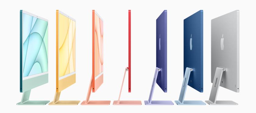
Today, Apple introduced the new iMac 24-inch. Based around the new M1 chip debuted last year, this surely will be a blazingly fast machine. A few initial observations:
- The new colors definitely look cool (unfortunately, a black option is missing)
- Only USB-C / Thunderbolt ports, no USB-A or card reader
- The power supply is now a separate brick, which was probably required given the thin design (only 11.5 mm!). The brick itself is not color-matched with the iMac body.
- The power brick includes an ethernet port, which is quite smart I think
- New Magic Keyboard, Magic Mouse and Magic Trackpad are color-matched with the iMac body.
- The front of the new iMac has nearly white bezels. At first sight, this looks extremely weird to me. Practically all other Apple devices have black bezels... Not sure why they went with such light bezels for the iMac.
- The typical iMac "chin" is still there, but the Apple logo has been removed. This too is rather strange... Looks like those iMacs they use in TV shows, were they tape over the logo.
- No word on a bigger screen size comparable to the current iMac 27-inch (which is still for sale). Maybe that version might get a more dark design with black bezels, who knows...
It's a bit ugly indeed, so I fooled around a bit and did some manipulations to the design :-) The mockups below show how the iMac would look like with black bezels and additional Apple logo on the chin.


To me, that looks a lot more inline with the rest of the line-up. Furthermore, black bezels tend to be more easy on the eyes as a frame for the content displayed on the screen.